Wello

Responsive web design, web development and branding

An image of Wello's website homepage

Overview

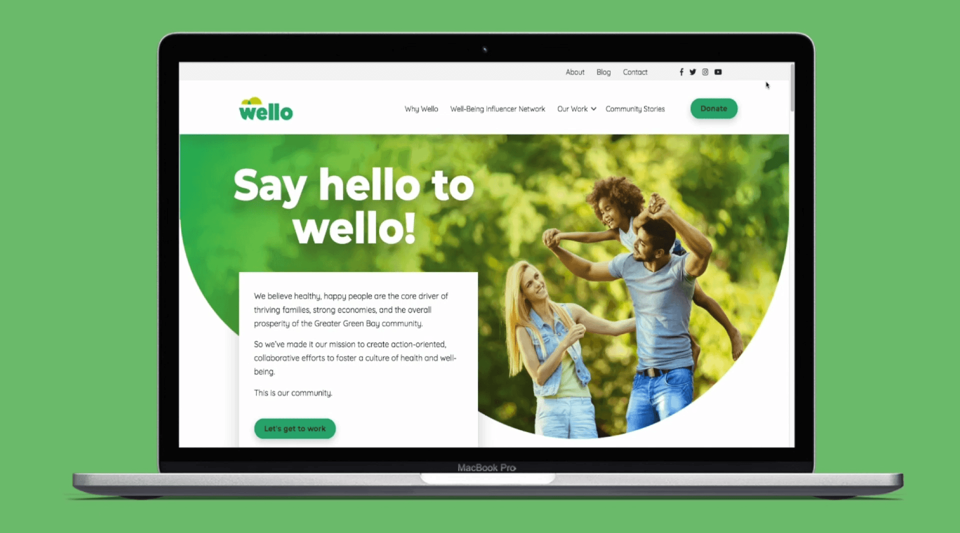
Wello is a non-profit organization with a mission to advance action-oriented community efforts, fostering a culture of health and well-being for all in Brown County, Wisconsin.

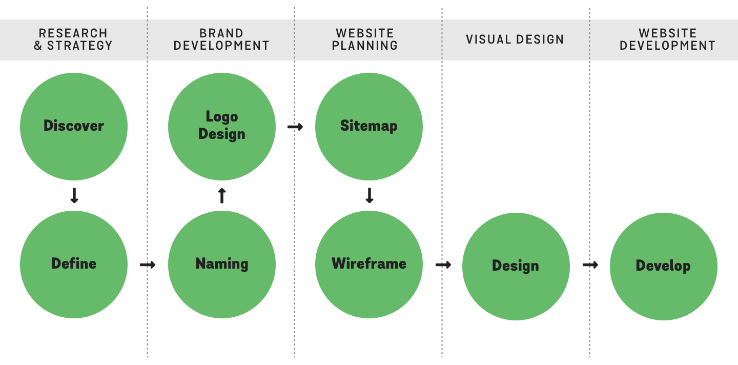
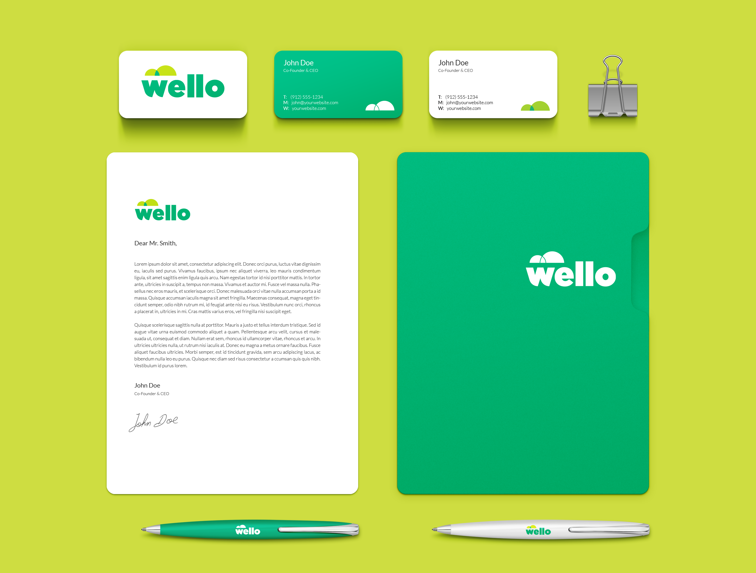
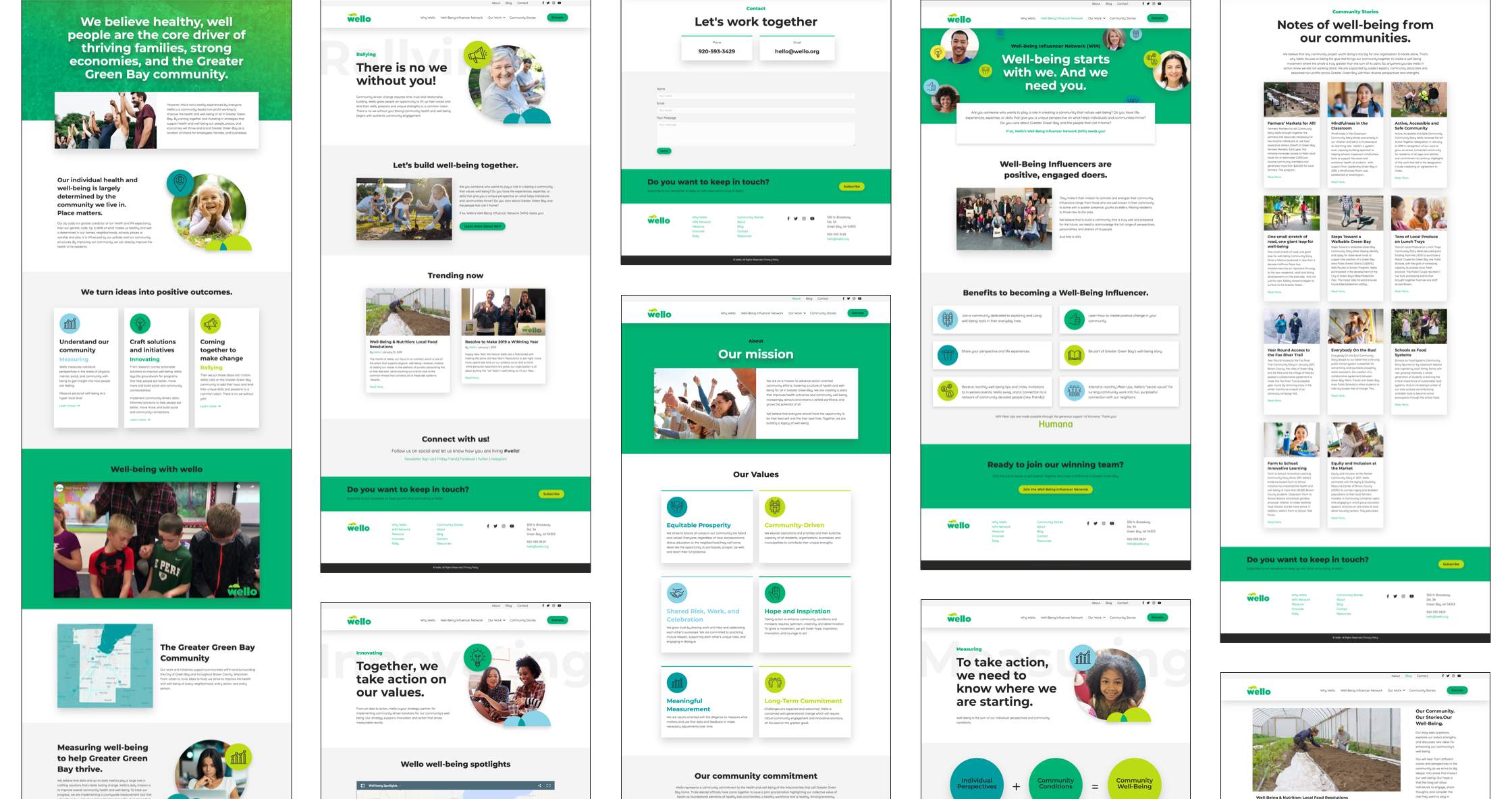
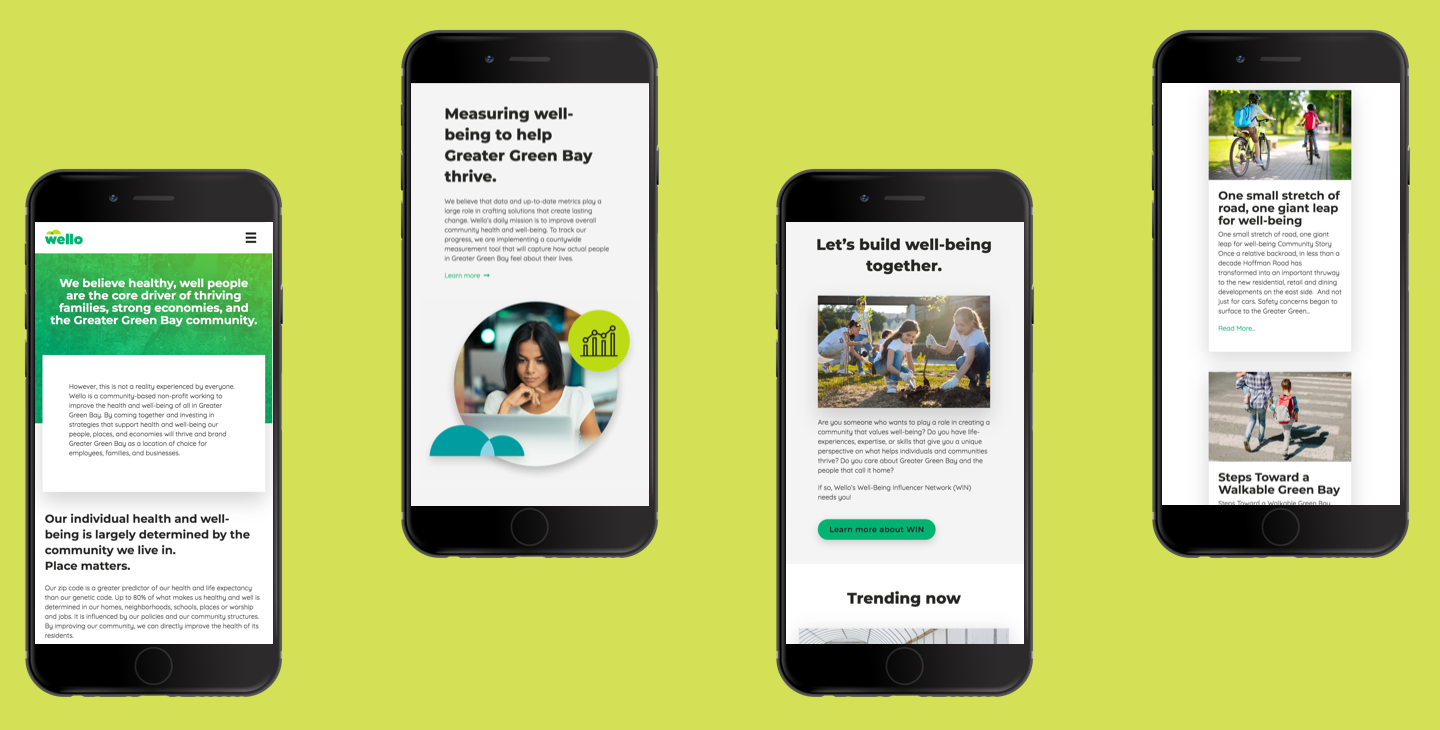
The goal of this project was to create a name, brand and website that would convey Wello’s mission and help them in their goal of spreading wellness in the community while also save them time and money in the future as the managed, updated and maintained the website.

Outcome

The Wello website and brand was successfully launched and presented to the community it serves. Wello is now proud to show and promote their brand that, now, truly reflect their mission. The website is easy for organization members' to use and update and has helped them to reduce website management costs and save them time.

Client

Wello

Platform

Web

Timeline

13 Months

My Role

I was responsible for the website design and developed and worked with an extended team on the naming and branding portion.

Throughout the whole project I worked with a Creative Director, Copywriter, and Account Executive. For the visual branding I also worked with an account strategist, a Junior Designer and a Senior Designer.

Responsibilities

  • User Experience Design
  • Brand Development
  • Brand Idenity System
  • Website Design
  • Website Development

Problem

Wello as an organization was going through a major change and they needed their name, brand and website to match that.

When we started working with the organization they were working under the name Live54218 and their main mission was addressing childhood obesity. They shifted their focus to advancing overall health, community productivity and individuals comprehensive well-being. They needed a new name, branding approach, and website to more effectively communicate their new, broader mission.

Process

To complete this project, I used a systematic approach of breaking down the whole project into smaller manageable chunks. This ensured the project was completed on time, delivered a suitable user experience and accomplished the project goals.

Process diagram

Discover

The first step in this project was to gather more information. The Account Strategist and I conducted research.

I conducted stakeholder interviews to get a better understanding about the needs and goals for the website. The Account Strategist conducted stakeholder and community member interviews to help define the organization’s brand.

Organization’s Strengths

Based on stakeholder interviews and community member interviews, a list of the organization’s strengths was created to start the branding process..

Results Driven
The organization bases initiatives around data, measurable results and key performance indicators. It takes ideas to the next level by making them actionable, credible and measurable.

Balanced
Focus on being balanced. By not only helping the community live a more balanced lifestyle, but actively creating a broad appeal and all-encompassing nature of the initiatives, the brand lends itself to helping all.

Inspirational
In order for change in any form to occur, something must spearhead that change and provide inspiration and motivation. This is exactly what the organization does. It provides the knowledge to implement change, and just as importantly, it provides the rally cry needed to make sure the change actually happens.

Steadfast
Trying to improve all aspects of wellbeing for a community is no small task. It’s a large and complicated endeavor that some could see as too big to complete. Yet the organization not only embraces the challenge, they look forward to it.

Brand Persona

Based on the information gathered from the interviews a brand persona was created to help define the personality of the organization and help to create a real connection between your company and users.

The Brand Persona is a set of human traits assigned to a branded product or service, aside from its literal and functional benefits. The Brand Persona is designed to give consumers attributes to which they can personally relate, and includes all the thoughts, feelings and imagery mentally linked to the brand.

brand persona words: passionate, inclusive, connected, energetic, smart, optimistic, influential, inspirational, good-listener, on-trend, forward-thinking and restults-driven

Positioning Statement

The Positioning Statement brings focus to the brand and helps guide future decisions. It solidifies the space the brand occupies in the minds of the audience(s).

The organization initiates cultural shifts towards better overall well-being within the Greater Green Bay community through an abundant network of resources, sponsors and research.

We are a collective of community-devoted people, ideas and initiatives, steadfast in our mission to help businesses and individuals identify and achieve their well-being goals.

Well-being starts with inspiration and accountability. Well-being starts with we.

Define

I defined the website’s requirements & goals based on the stakeholder interviews I conducted. Then, I determined the best Contentment Management Systems (CMS) and other technical platforms that would be used in the website based on the website’s requirements, goals and budget.

Requirements & Goals

In order to make sure the website I created would achieve the organization’s objectives, I started by clearly define the requirements and goals of the website. These requirements and goals informed the website strategy and influence each decision made. The goals also ensure the website works toward reaching the organization’s most important marketing and business objectives.

Website Requirement List:
  • Display Wello’s Health Measurement tool results
  • Create a Well Being Influencer Network Application form
  • Have a functional and easy to update Blog
  • Have a contact form and Information so users and doners and easily get in touch with the organization
  • Link to Paypal donation page so donations can be easily made
  • Have an interactive map that showcase well-being spotlights in the community
  • Links to classroom resources for teachers and school
Website Goals:
  • Content needs to reflect what the current with the organization and content needs to be easily added, edited and updated.
  • The content and design must match their current mission so potential partners can access the information and easily sponsor and/or support the organization.
  • The new website should reduce website management costs by allowing organization members to update and edit the site.
  • The new website must engage with the community members, community businesses, and community leaders.

Naming

Based on the information gathered in the initial discovery, The Copywriter and Creative Director lead the naming process while collaborating with the rest of the team. Six name options and research behind each were presented to the client, and they chose Wello!

Wellnest

Nest has powerfully positive connotations of warmth, care and growth. Its use clarifies your position as a comfortable and safe place; it’s a place to learn, to improve and to make connections. Invite everyone, young and less young, to join a lively, nurturing family, steadfast in its mission to help the Green Bay community flourish. Wellnest is both a mindset of advancing well-being and a physical location members of our community can keep returning to (nest) when they need a little wellness boost.

Wellbridge

Well-being is your mission. And to succeed in your mission, you need to make lasting connections throughout Greater Green Bay’s cities, towns and neighborhoods. Wellbridge is an open call, asking residents of any race, gender or social status to all cross whatever obstacles are preventing us from being well. The use of “bridge” also evokes a hometown sentiment due to Green Bay’s many river crossings.

Wello

While obvious in its intention to help people achieve their wellness goals, Wellow also drums up a sense of calm, understanding, illumination and youth. The road to better well-being is challenging, making a fun and inviting brand persona a welcomed counterbalance. A lighthearted, cheerful name draws in people who are on the fence about participating. It’s catchy, and it’s something people want to talk about.

Hive

Activate a grassroots movement brimming with activity by utilizing a memorable name that evokes both belonging and community. Hive is Green Bay’s home for well-being, and it’s a place we all have a hand in creating. It’s an impactful name signifying that your team creates the inspiration and framework to mobilize a healthier community. We all belong. We must succeed together to build a strong Hive.

Embark

Quite literally meaning to set forth or begin a course of action, this strong, adventurous name appeals to those looking for a little help starting a path towards betterment. Embark plants the seed in the Greater Green Bay community that your organization equips people with the tools to create, initiate and complete their well-being journey(s). The name Embark calls to mind images of outdoor events, exercise, eating clean and ambition.

Motivo

Vivacious, abstract and modern. A charged-up meld of motivation, motion and motif, Motivo mirrors the inspiration to be well and the ambitious well-being initiatives you provide to the Greater Green Bay community. An active name tells the community that your wellness collective continually strives to innovate, improve and move forward. With Motivo as the name, your organization will be instantly recognizable.

Logo Design

After Wello was chosen as the name for the organization, the Creative Director lead the logo development process.

Sketches

Taking the research into consideration, I sketched logo ideas.

logo sketches

Photo: Logo sketches

First Iterations

I took my most promising sketches and began to digitize them. Then, I presented them for critique by the other designers on the team. Based on their feedback, I continued to refine and edit them.

refining digitized logo options

Photo: refining digitized logo options

Presented Options

After many critiques and iterations, I honed in on three possible logo options to present to the client.

Option A
Wello logo option A

Bold yet comfy, this option utilizes friendly and cheerful letterforms with an accompanying geometric mark. The mark hovers over the ‘we’ delivering feelings of security and the rounded corners of the ‘w’ create forward movement. The fluffy/cumulus cloud-based abstract mark represents unity, optimism, inspiration, and the coming together of ideas and people. We are all different, but united in our commitment to well-being.

Option B
Wello logo option B

Here, flowy letterforms grab attention and give Wello instant energy and playfulness. The organic, hand-drawn letterforms represent an outgoing and friendly organization. Presented in one continuous stroke, Wello is announced as an entity connected and in lockstep with the community. The consistent thickness/monoline throughout the letters conveys balance and harmony. Wello is a place to grow and move forward with a community behind you. And that’s precisely what this logo represents.

Option C
Wello logo option C

Rounded geometric forms are sharp, but not harsh, Innovative and modern. The hearty letterforms create stability and balance and the curves create a movement. Plant and flower forms come together to form the beginning and inspiration of ‘Wello,’ representing growth, health, and prosperity. The abstract ‘w’ has the strength to become a stand-alone mark, lending versatility and variety to branding options.

Final Logo

After presenting several logo options to the client, they chose the final logo.

Finial Wello logo

Photo: Final Wello logo

Finial Wello logo

Photo: Final Wello black version

Finial Wello logo

Photo: Final Wello white version

Sitemap

After the website’s requirements and goals were clearly defined, I created a sitemap.

The sitemap worked as a diagram to communicate the website's hierarchy and show where each page fits into this hierarchy. As I built the sitemap, I referenced the project’s goals so it would reflect and contribute to the fulfillment of that goal.

Wello website sitemap

Photo: Wello website sitemap

Wireframe

I created wireframes begin to work as a blueprint for the website. I started with a low-fidelity wireframe to first get approval on the basic website hierarchy and features. After that was approved, I created high-fidelity wireframes to get approval on the website content and layout.

Low-Fidelity Wireframe

In order to show how elements are laid out on the page and how the site navigation should work, I created low-fidelity wireframes. I walked the stakeholders through these wireframes to get their feedback on the structure, then made adjustments based on their feedback.

Low-fidelity Wello website wireframes

Photo: Low-fidelity Wello website wireframes

High-Fidelity Wireframe

After the low-fidelity wireframes were approved and the project progressed to a point where requirements become clear and we agreed upon the structure of the screen, features, and prioritization of information, I created high-fidelity wireframes with content and presented them to the stakeholders. These wireframes helped the stakeholders give better feedback and helped me I was doing the visual design to understand space constraints and helped me speed up the entire website development process.

High-fidelity Wello website wireframes

Photo: High-fidelity Wello website wireframes

Design

Once the logo was completed and the wireframes were done, the visual design began. In order to complete the branding process, we established the brand look & feel, typography and color pallette. This established the visual attitude and personality that differentiates a brand.

Style Guide

The style guide is a set of standards that is used for the brand and website. The implementation of a style guide provides uniformity. This helps create consistency that makes the brand become recognizable, and brings a sense of reliability and security.

Grid

I used a 12 column responsive grid. This helped to add balance, order, and visual harmony to the web layouts.

sitemap diagram

Color Pallette

We wanted the palette to feel vibrant and fresh whilst also using colours that could clearly communicate wellness. To make sure the colors also practical and not just aesthetic I made sure to test them for accessibility.

sitemap diagram

Typography

We decided upon the typefaces “Montserrat” and “Quicksand”. We chose these fonts so the client could easily apply them across many mediums, and because the because their clean, rounded style feels approachable and modern.

sitemap diagram

Imagry and Icons

We decided upon the typefaces “Montserrat” and “Quicksand”. We chose these fonts so the client could easily apply them across many mediums, and because the because their clean, rounded style feels approachable and modern.

sitemap diagram

Develop

To develop the website I set up a local development environment. Then I completed the development of the WordPress website using PHP, HTML, CSS/Sass, and JavaScript.

Screen shot of programming Wello's website in Visual Studio Code

Photo: Wello's website in Visual Studio Code

Solution

Once all the elements including the name, logo, typography, color palette came together together, Wello had a brand that reflected their aims and attitude. The website now clearly communicates their mission and it will be able to grow with them, as they can now easily edit and change they website as they see fit.

Wello branding collateral
Wello logo in color
Wello website homepage
Wello website screenshots
Front view of Hershey's Smile Sampler in a aisle

Conclusion

The Wello website and brand was successfully launched and presented to the community it serves. Wello is now proud to show and promote their brand that, now, truly reflect their mission. The website is easy for the employee's to use and update and has helped them to reduce website management costs.

 View the Wello website

Project Insights

  • Process is important
    For a project like this, with a vast scope and extensive, intermittent, timeline, it is important to break it up into smaller, more manageable sections, and to have a clear roadmap to keep the end goal in mind.
  • Remember project goals
    When making design decisions, it’s always important to keep the project goals in mind. The design should facilitate achieving the project goals.